元素居中是日常开发和学习中最常见的问题,同时也是面试中经常考察的知识点,本文来总结一下这方面的知识点。
1、水平居中
(1)子父元素宽度固定,子元素设置 margin:auto,并且子元素不能设置浮动,否则居中失效。

<div class="wrap">
        <div class="inner"></div>
    </div>
    <style>
        .wrap {
            width: 500px;
            background-color: skyblue;
        }
        .inner {
            width: 200px;
            height: 100px;
            background-color: sandybrown;
            margin: auto;
        }
    </style>
(2)子父元素宽度固定,父元素设置 text-align:center,子元素设置display:inline-block,并且子元素不能设置浮动,否则居中失效。


    <div class="wrap">
        <div class="inner"></div>
    </div>
    <style>
        .wrap {
            width: 500px;
            background-color: skyblue;
            text-align: center;
        }

        .inner {
            width: 200px;
            height: 100px;
            display: inline-block;
            background-color: sandybrown;
        }
    </style>

2、水平垂直居中
(1)子父元素宽高度固定,子元素相对于父元素绝对定位(子绝父相),子元素 top,left 设置 50%,子元素margin-top 和 margin-left 减去各自宽高的一半或者 transform:translate(-50%,-50%)。

    <div class="wrap">
        <div class="inner"></div>
    </div>
    <style>
        .wrap {
            width: 500px;
            height: 200px;
            background-color: skyblue;
            position: relative;
        }

        .inner {
            width: 200px;
            height: 100px;
            background-color: sandybrown;
            position: absolute;
            top: 50%;
            left: 50%;
            /* transform: translate(-50%, -50%); */
            margin-top: -50px;
            margin-left: -100px;
        }
    </style>
(2)子父元素宽高度固定,子元素相对于父元素绝对定位(子绝父相),使用calc达到上面效果。

    <div class="wrap">
        <div class="inner"></div>
    </div>
    <style>
        .wrap {
            width: 500px;
            height: 200px;
            background-color: skyblue;
            position: relative;
        }
        .inner {
            width: 200px;
            height: 100px;
            background-color: sandybrown;
            position: absolute;
            top: calc(50% - 50px);
            left: calc(50% - 100px);

        }
    </style>
(3)子父元素宽高度固定,子元素相对于父元素绝对定位(子绝父相),子元素上下左右全为 0,然后设置子元素margin:auto。

    <div class="wrap">
        <div class="inner"></div>
    </div>
    <style>
        .wrap {
            width: 500px;
            height: 200px;
            background-color: skyblue;
            position: relative;
        }
        .inner {
            width: 200px;
            height: 100px;
            background-color: sandybrown;
            position: absolute;
            top: 0;
            left: 0;
            bottom: 0;
            right: 0;
            margin: auto;
        }
    </style>
(4)子元素相对定位,子元素 top,left 值为 50%,transform:translate(-50%,-50%)。
    <div class="wrap">
        <div class="inner"></div>
    </div>
    <style>
        .wrap {
            width: 500px;
            height: 200px;
            background-color: skyblue;
        }
        .inner {
            width: 200px;
            height: 100px;
            background-color: sandybrown;
            position: relative;
            top: 50%;
            left: 50%;
            transform: translate(-50%, -50%);
        }
    </style>
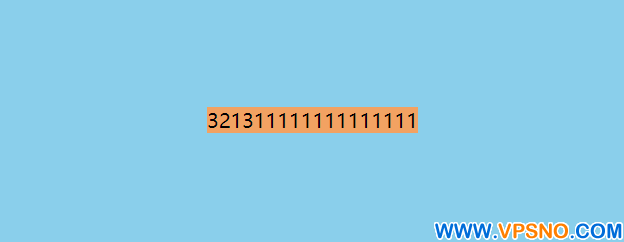
(5)文本水平垂直居中 父元素设置text-algin:center使得子元素水平居中,子元素设置line-height为父元素高度,使得子元素垂直居中。
    <div class="wrap">
        <span class="inner">321311111111111111</span>
    </div>
    <style>
        .wrap {
            width: 500px;
            height: 200px;
            text-align: center;
            background-color: skyblue;
        }

        .inner {
            line-height: 200px;
            background-color: sandybrown;
        }
    </style>
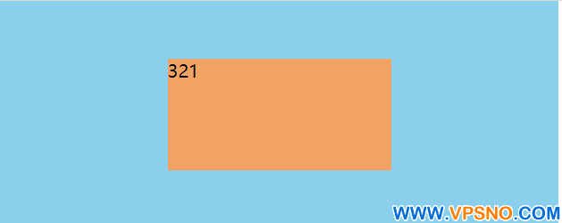
(6)利用line-height,vertical-align实现元素水平垂直居中。

    <div class="wrap">
        <div class="inner">321</div>
    </div>
    <style>
        .wrap {
            width: 500px;
            height: 200px;
            background-color: skyblue;
            line-height: 200px;
            text-align: center;
        }
        .inner {
            width: 200px;
            height: 100px;
            background-color: sandybrown;
            display: inline-block;/* 将子元素设置为行内块级元素 */
            vertical-align: middle;/* 垂直居中 */
            text-align: left;/* 默认继承了父元素的水平居中,这里需要修正修正文字 */
        }
    </style>
(7)父元素设置弹性盒子,display:flex; justfy-content:center ;align-item:center。

    <div class="wrap">
        <div class="inner"></div>
    </div>
    <style>
        .wrap {
            width: 500px;
            height: 200px;
            background-color: skyblue;
            display: flex;
            justify-content: center;
            align-items: center;
        }

        .inner {
            width: 200px;
            height: 100px;
            background-color: sandybrown;
        }
    </style>
(8)父元素设置 display:table-cell vertical-align:middle,子元素设置 margin:auto。

    <div class="wrap">
        <div class="inner"></div>
    </div>
    <style>
        .wrap {
            width: 500px;
            height: 200px;
            background-color: skyblue;
            display: table-cell;
            vertical-align: middle
        }
        .inner {
            width: 200px;
            height: 100px;
            background-color: sandybrown;
            margin: auto;
        }
    </style>
(9)网格布局实现水平垂直居中display: grid;place-items: center。
    <div class="wrap">
        <div class="inner"></div>
    </div>
    <style>
        .wrap {
            width: 500px;
            height: 200px;
            background-color: skyblue;
            display: grid;
            place-items: center;
        }

        .inner {
            width: 200px;
            height: 100px;
            background-color: sandybrown;
        }
    </style>
以上就是本文的全部内容,希望给读者带来些许的帮助和进步,方便的话点个关注,小白的成长之路会持续更新一些工作中常见的问题和技术点。